Web Design · Brand Communications · 2025
Saidu B. Samaila & Co.
Digital presence and service architecture for a Nigerian chartered accounting firm
The problemA 40-year-old chartered accounting practice with public-sector accreditation had no credible digital presence — prospective clients, partners and institutional bodies had no way to verify who the firm was or what it actually did.
Timeline
- Client project · shipped and live
My role
- Designer & Digital Experience Lead
Skills used
- Information architecture
- Content strategy
- Visual design
- Copy structuring
- Client facilitation
- Responsive web design
- SEO fundamentals
Tools used
- Figma
- Next.js
- Tailwind CSS
- Vercel
- Google Search Console
Outcomes
Live
in production at sbsamailaaccountants.com
4
service divisions structured into one navigable system
1
enquiry route replacing scattered phone and WhatsApp contact
Why
Why the client needed this
Client · Saidu B. Samaila & Co. Chartered Accountants — Nigeria
The firm competes for audit, tax and public financial management work where credibility is the product. Institutional clients and international partners check you online before they call. With nothing to check, decades of licences, accreditations and public-sector experience were invisible at exactly the moment they mattered.
They also needed to present a second, newer offer — the Chamco Digital training arm — without diluting the seriousness of the accounting practice. Two audiences, two tones, one firm. That tension shaped almost every structural decision I made.
Role
What I personally did
My responsibilities
- Ran the discovery conversations with the principal partner to extract scope, services and proof points
- Turned dense professional documents and profiles into a structured content model
- Defined the information architecture: About, Corporate Profile, Services, Leadership, Training, Contact
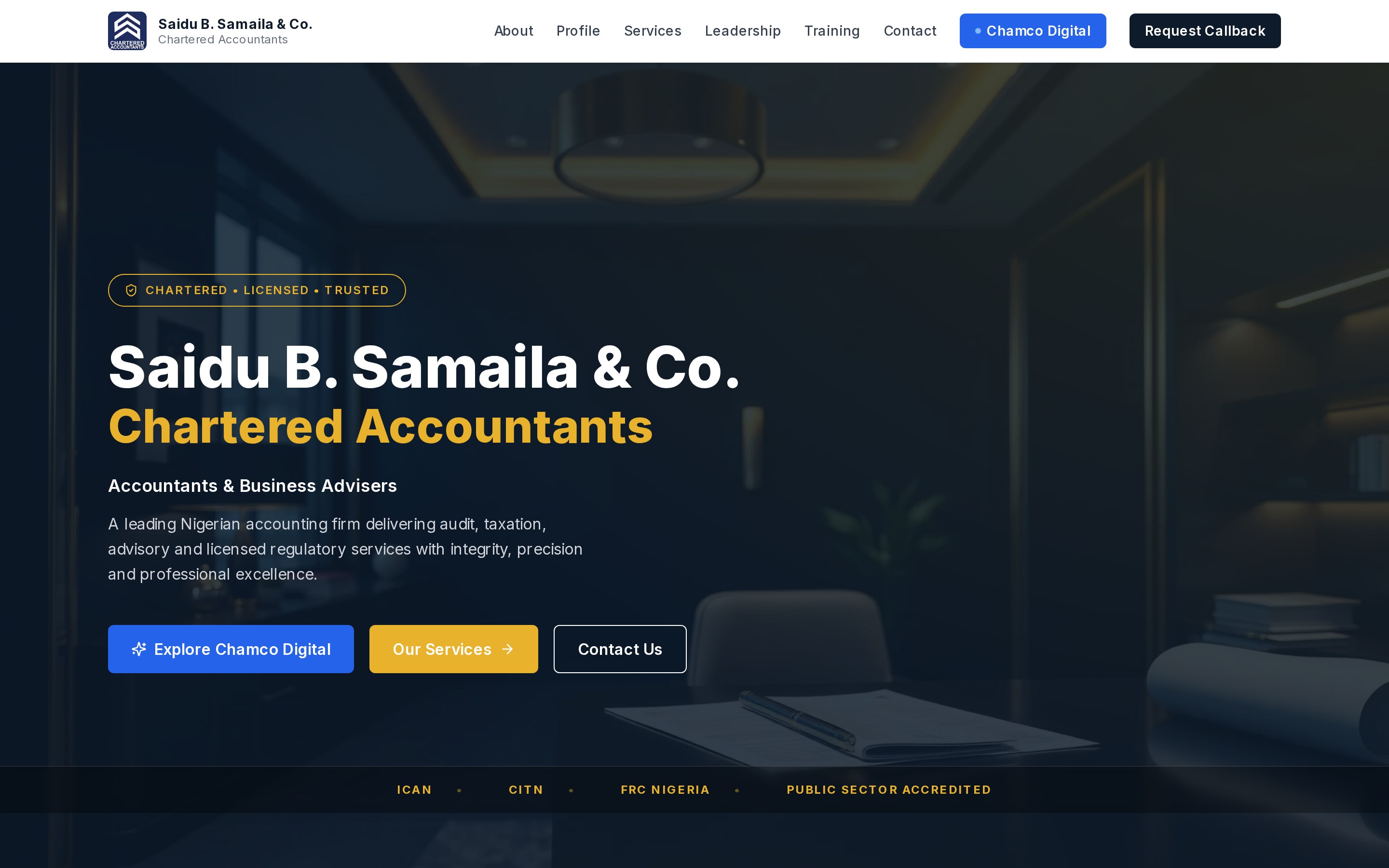
- Designed the full visual system — type, dark hero treatment, accreditation strip, service cards
- Wrote and edited the on-page copy for clarity, scanning, and search
- Built and shipped the responsive site, then handled deployment and post-launch fixes
Team · Worked directly with the principal partner as sole design and build lead, with the firm's staff supplying source material and reviewing accuracy of professional claims.
Decisions I owned
Credibility above the fold, not in an About page
I moved the accreditation marks (ICAN, CITN, FRC Nigeria, public-sector accredited) and the principal partner's credentials into the first screen. In this sector, proof is the value proposition — burying it in a sub-page was the original failure.
Four divisions instead of a service list
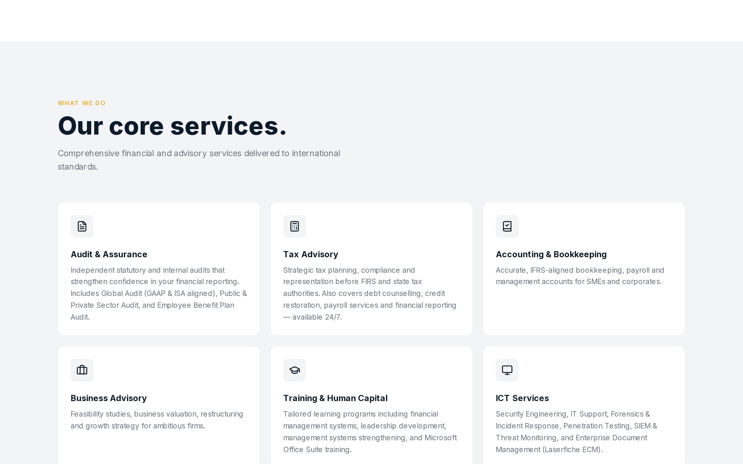
The firm described itself through a long, flat list of offerings. I restructured it into four divisions — Audit & Assurance, Tax & Consultancy, Training & Human Capital, ICT — so a visitor can self-identify in one read instead of scanning twenty items.
Chamco Digital as a linked destination, not a section
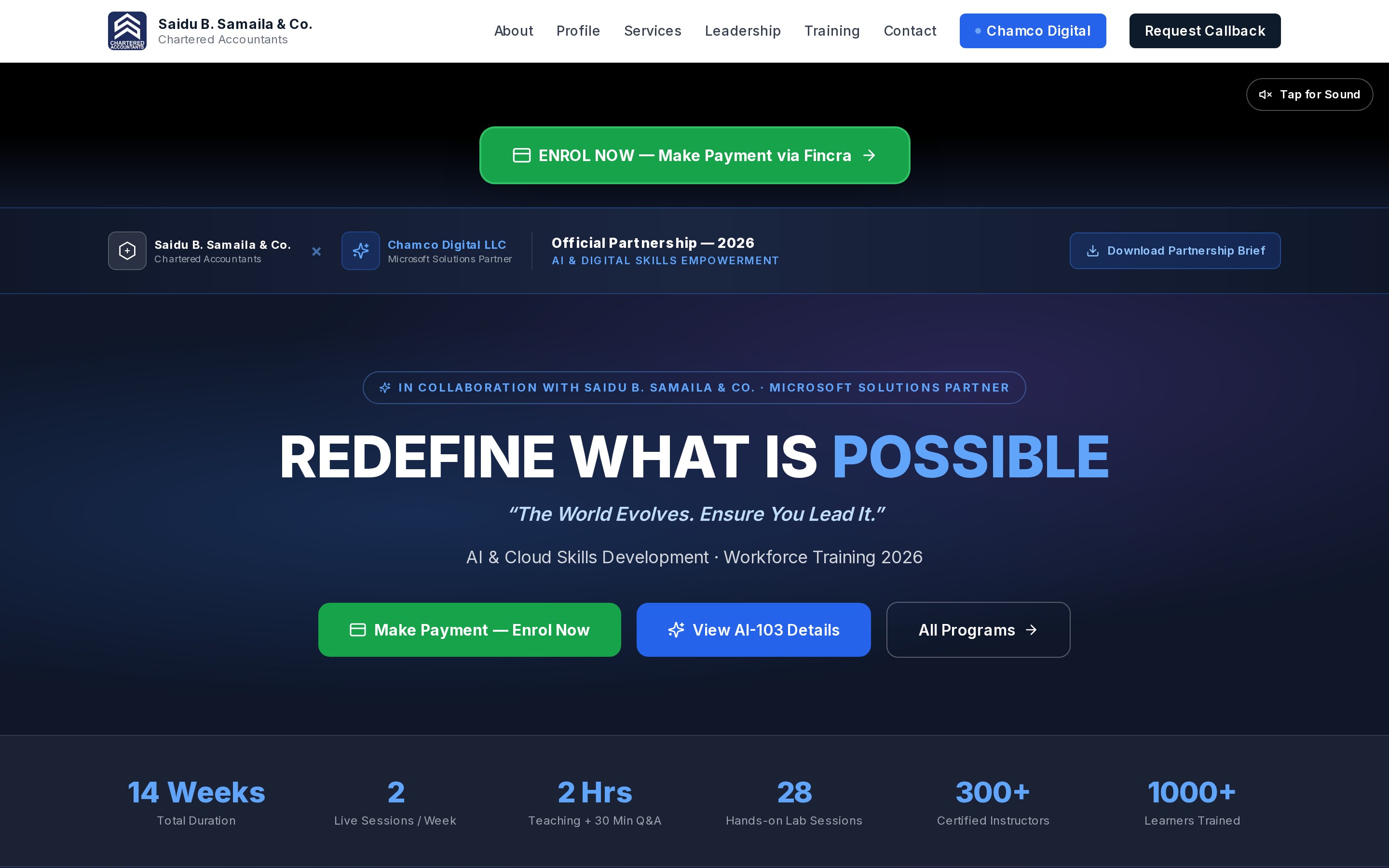
The training arm speaks to individual learners, not institutional clients. Instead of mixing the tones, I gave it a distinct entry point and its own page, keeping the main site's register consistent while still routing traffic to the new offer.
One qualified enquiry route
Enquiries had been arriving through personal phone numbers and WhatsApp with no service context. I designed a contact form with a service-needed selector, so every enquiry arrives pre-routed to the right division.
01
Challenge
Saidu B. Samaila & Co. is a chartered accounting and advisory firm with more than forty years of practice, public-sector accreditation, and work across audit, taxation, public financial management and ICT. None of that was visible online.
In professional services, the website is not marketing — it is due diligence. An institutional client, a development partner, or a graduate considering the firm's training programme all do the same thing first: they look you up. The firm was losing those people before a conversation could start.
Invisible credibility
Licences, accreditations and partner credentials existed only in documents nobody outside the firm ever saw.
Unstructured offering
Services were described as a long flat list, making it hard for any visitor to locate themselves.
Unqualified enquiries
Contact happened through personal numbers, arriving with no service context and no record.
02
Research
This was not academic research — it was client discovery under real constraints. I worked through the firm's corporate profile documents, service descriptions, partner affiliations and training materials with the principal partner, separating what was legally precise and untouchable from what was simply unstructured.
I then looked at how comparable Nigerian and international accounting firms present themselves online, specifically at what appears in the first screen. The pattern was consistent: named leadership, visible accreditation, and clearly bounded service divisions. The firms that felt least credible were the ones leading with generic corporate language.
Goal
Let a prospective client verify the firm's legitimacy and locate the right service within one screen and one click.
Insight 01
In this sector trust is carried by specifics — names, credentials, accrediting bodies — not by tone of voice.
Insight 02
Visitors arrive already knowing which problem they have. Structure by division beats persuasion.
Insight 03
The training audience behaves completely differently from the audit audience and needed separating.
03
Design Process
I began with the content model rather than layout: every piece of source material was sorted into About, Corporate Profile, Services, Leadership, Training and Contact, which became the navigation. Anything that did not fit a visitor's question was cut or moved to the corporate profile section for readers who want depth.
Visually, I chose a restrained dark treatment with a single warm accent. The logic was straightforward — accounting sites in this market often over-decorate to compensate for a lack of substance. Restraint plus real proof reads as more serious, and the dark hero lets the accreditation strip carry the emphasis instead of the imagery.
Layouts were designed mobile-first, since most of the firm's traffic arrives on phones over mobile data. Long professional prose was broken into stacked cards with a plain-language heading above each dense block, so the same content works for a skimmer and for a procurement officer reading every line.
Structure
Content model and navigation defined before any visual design work began.
Hierarchy
Credibility markers promoted to the first screen; long-form profile moved below for depth readers.
Separation
Training arm given its own page and tone rather than being mixed into the main narrative.
04
Development
I designed and built the site myself, moving from Figma into a Next.js and Tailwind CSS implementation deployed on Vercel. Building it rather than handing off a file meant the structural decisions survived into production intact — the thing shipped is the thing designed.
Practical work included compressing and lazy-loading imagery for mobile connections, wiring the service-selector enquiry form, setting page titles and descriptions for search, and testing every layout down to small screens. After launch I handled fixes and content updates directly with the partner.
Design
Figma — type scale, component patterns, responsive layouts.
Build
Next.js, Tailwind CSS, optimised imagery, deployed on Vercel.
Launch
Search metadata, mobile performance passes, post-launch iteration with the client.

05
Final Solution
The live site opens with the firm's name, what it does, and the bodies that license it — the three things a prospective client is actually checking. Below that, four service divisions let a visitor identify their own problem, with the full corporate profile available for anyone who needs the detail.
The training arm has its own destination with its own tone and enrolment path, and every route ends in one contact form that captures which service is needed. The result is a site that does the firm's qualifying work before a human is involved.
06
Reflection
This project taught me that in professional services, design's job is often subtraction and sequencing rather than expression. The most valuable decision I made was structural — four divisions instead of a list — and it came from communications thinking, not visual craft.
It also taught me the discipline of designing around claims I was not allowed to soften. Working with regulated professional language forced me to restructure without rewriting, which is a harder and more useful skill than starting from a blank brief.
What I would do differently: instrument it properly from day one. I would set up analytics and enquiry tracking before launch so the impact story is quantitative rather than descriptive — which is exactly the habit I want to build on in graduate study.
07
Challenges I overcame
Source material written for regulators, not readers
The firm's existing profile documents were formal, dense, and written to satisfy compliance bodies. I could not simply paste them in, and I could not casually rewrite claims about licensing. I restructured rather than reworded: kept the exact professional language where accuracy mattered and added scannable summaries above it.
Two audiences with opposite expectations
Institutional audit clients want restraint. Training enrolees respond to urgency and momentum. Merging them would have cost credibility with the first group, so I split them across pages and gave each its own tone and calls to action.
Trust signals in a low-trust market
Nigerian professional services deal with real scepticism online. I designed for verifiability — named leadership with full credentials, visible affiliations and partners, real office contact details and a physical address — rather than relying on design polish to imply legitimacy.
Performance on Nigerian mobile connections
Most visitors arrive on mobile data. I kept the build lean, compressed and lazy-loaded imagery, and tested the layouts down to small screens so the site stays usable on a slow connection.
08
Impact
The site is live in production and is the firm's primary point of verification for prospective clients, institutional partners and training enrolees. It is the reference I point to when someone asks whether I can ship real client work, not just concepts.
The clearest measurable change is qualification: enquiries now arrive through a single form that captures which service the visitor needs, so the firm knows the context before it responds. Beyond the site itself, the four-division structure became the way the firm describes its own offering.
| Measure | Before | After |
|---|---|---|
| Verifiable web presence | None | Live at sbsamailaaccountants.com |
| How services were presented | Flat list in a PDF profile | Four navigable divisions |
| Enquiry route | Personal phone and WhatsApp | Service-routed contact form |
| Credibility signals visible on arrival | 0 | Accreditations, leadership credentials, partners |
Gallery
Explore the work
Open the artefacts directly — prototype, live site, documents, video, and before/after comparisons behind Saidu B. Samaila & Co.. Each opens in an in-page viewer.