Brand Strategy · Digital Platform · 2024
Self-Directed Concept Project
Kindred
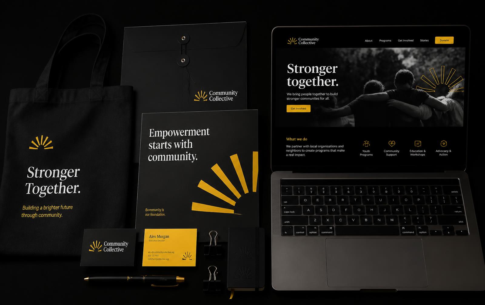
Brand and digital platform redesign for a community nonprofit
The problemA 22-year-old nonprofit with real neighbourhood impact was being read as inactive, because its identity and website spoke funder language and buried every path to participation.
Timeline
- 11 weeks · Jun – Aug 2024
My role
- Creative Strategist & Digital Designer
Skills used
- Brand strategy
- Content strategy
- Visual identity
- Stakeholder facilitation
- Accessibility
- Copywriting
Tools used
- Figma
- Illustrator
- Webflow
- Hotjar
- Google Analytics 4
- Miro
Outcomes
Structured to
improve volunteer sign-up conversion through a simplified information architecture and one clear call to action
9 → 4
top-level sections, reorganised around two visitor intents
AA
WCAG 2.2 contrast and focus rules locked at token level in the design system
Why
Why the client needed this
Client · Kindred — community nonprofit, two-person communications team
Kindred's volunteer pipeline had thinned for three consecutive years while programme demand grew. Their board read this as a marketing budget problem; their analytics showed people arriving on programme pages and leaving within seconds.
They needed something they could run themselves after handover — no retainer, no developer — and they needed it accessible, because a meaningful share of their audience uses screen readers or low-bandwidth mobile.
Role
What I personally did
My responsibilities
- Facilitated three stakeholder workshops with staff, board, and long-term volunteers
- Ran 12 interviews across current volunteers, lapsed donors, and non-engaged neighbours
- Audited analytics and heatmaps, and set the GA4 event model for both conversion paths
- Rebuilt the information architecture and wrote the site copy
- Designed the identity system: mark, type, colour, and the ray graphic device
- Built the Webflow site and CMS, then wrote the editorial guide and ran two staff trainings
Team · Executive director, communications coordinator, and a five-member board committee. I was the sole strategist, designer, and builder.
Decisions I owned
Two intents, not nine sections
I cut top-level navigation from nine items to four by structuring around 'I want to help' and 'I need help'. That meant retiring pages some board members had championed.
Time commitment before mission statement
Interviews showed volunteers decide on time first. I moved commitment detail above the fold on every programme page against the instinct to lead with mission.
Webflow over a custom build
I recommended a platform the team could maintain unaided rather than the bespoke site that would have been a better portfolio piece. Independence after handover was the actual brief.
01
Challenge
A self-initiated concept exploring brand and digital platform design for a community nonprofit.
Kindred had served its neighbourhood for twenty-two years and had the outcomes to prove it — but its website read like an internal memo. Programme pages were written in funder language, the donation path took seven clicks, and the identity had drifted into four unofficial logo variants across print and social.
The organisation's leadership framed this as a redesign. My research reframed it as a credibility problem: the digital presence was actively underselling the work, and the people most likely to volunteer were the least able to understand what was on offer.
Language mismatch
Programme copy was written for grant reports, not for neighbours.
Broken conversion
Seven steps between intent and a completed volunteer sign-up.
Identity drift
Four logo variants and no documented type or colour system.
02
Research
I facilitated three stakeholder workshops with staff, board, and long-term volunteers, then ran twelve interviews split across current volunteers, lapsed donors, and neighbours who had never engaged. Analytics and heatmap review gave me the behavioural half of the picture; the interviews gave me the why.
The clearest signal came from people who had almost engaged and stopped. Nobody doubted the mission. They doubted whether the organisation was still active — an impression created entirely by an outdated interface and undated content.
Goal
Convert latent goodwill in the neighbourhood into measurable participation.
Insight 01
Recency signals — dated posts, live numbers, recent photos — drove perceived legitimacy.
Insight 02
Volunteers wanted to know the time commitment before anything else.
Insight 03
Donors and volunteers needed genuinely different paths, not one blended CTA.
03
Design Process
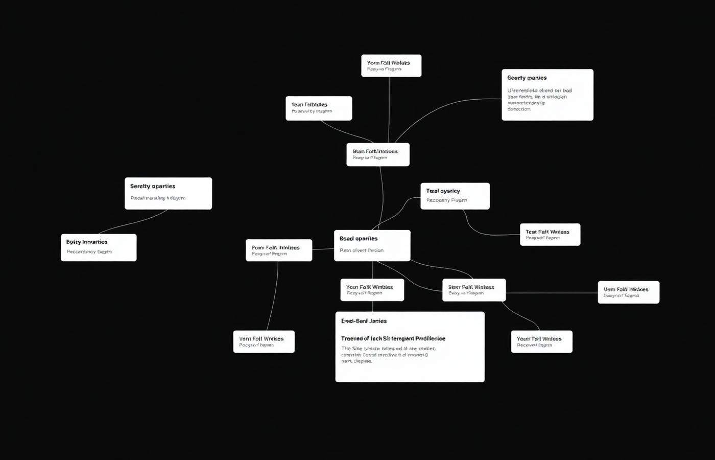
I rebuilt the information architecture around two intents — I want to help and I need help — and made everything else subordinate. That decision alone cut the top-level navigation from nine items to four and gave every page a single obvious next action.
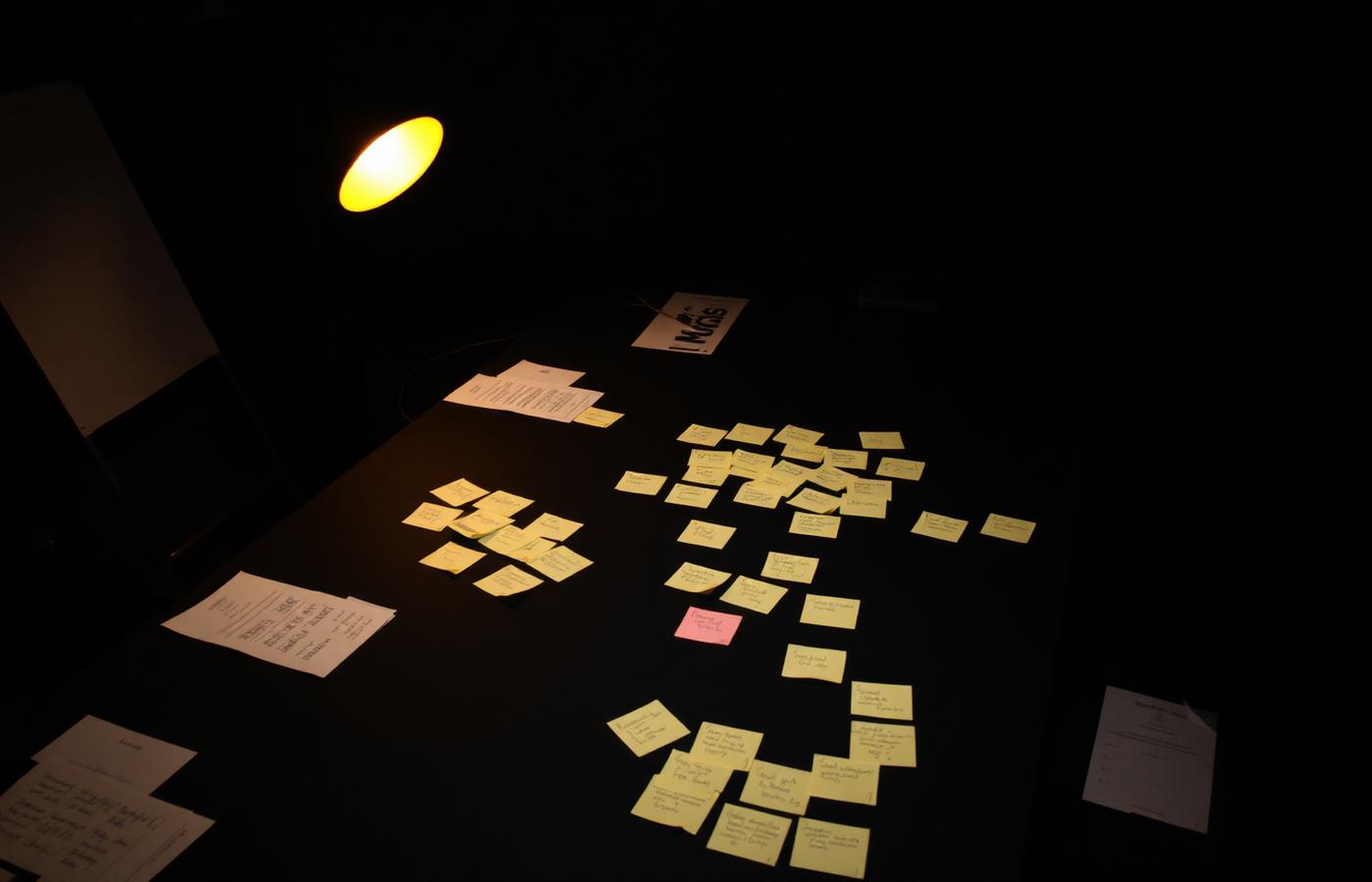
The identity work ran in parallel. Sketch rounds explored a sunrise mark drawn from the organisation's own founding language, refined across three iterations from literal to geometric. I paired it with a warm neutral palette and a single confident accent so that photography of real people could carry the emotional weight instead of decoration.
Every page template was drafted as a content-first wireframe with real copy before any visual design, so that layout decisions served the message rather than the other way around.
Iteration 01
Literal sunrise mark — warm, but indistinguishable from a dozen peer charities.
Iteration 02
Geometric ray system introduced; worked at favicon size for the first time.
Iteration 03
Rays adopted as a flexible graphic device for section dividers and data.
04
Development
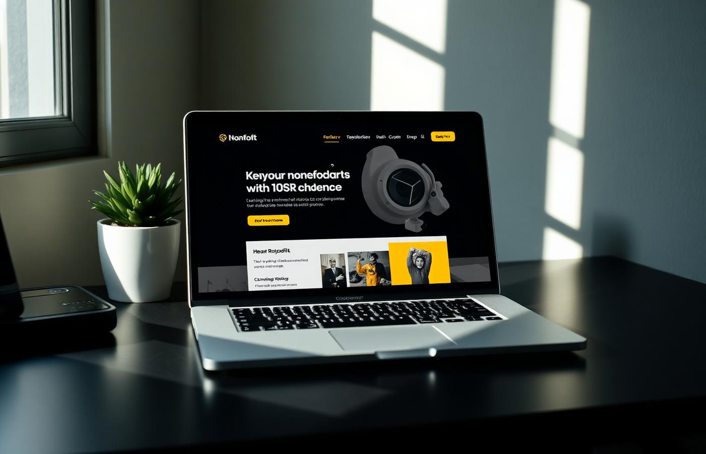
The platform was built in Webflow so the two-person communications team could maintain it without a developer, with a CMS structured around programmes, stories, and events. I built the component library, set up the CMS collections, and wrote a twenty-page editorial guide covering voice, image selection, and accessibility.
Accessibility was a build requirement, not a review step: contrast ratios were locked at token level, every interactive element received a visible focus state, and the whole site was keyboard-tested before launch.
Build
Webflow CMS, custom component library, structured collections.
Measure
GA4 event tracking on both conversion paths, Hotjar session review.
Handover
Editorial guide, brand book, and two staff training sessions.
05
Final Solution
The new Kindred leads with people and proof. The homepage answers three questions above the fold — what we do, who it is for, and how to join — and every programme page states its time commitment before its mission statement.
The identity carries across print, signage, and social with a documented system the team can extend. The measure of success I set for it is independence: a communications lead publishing weekly without design support.
06
Reflection
This project taught me that a rebrand is a change management project wearing a visual costume. The design work was straightforward; the work that mattered was getting a board with twenty-two years of attachment to agree on what to let go of.
I would build measurement in earlier — we set up analytics after the IA was locked, which cost us a clean baseline. The next opportunity is a lightweight impact dashboard so the recency signals that drive trust update themselves rather than depending on staff time.
Process
Process documentation
The artefacts behind the final screens — sketches, architecture, wireframes, and the iterations that were rejected along the way, with the reasoning attached to each.
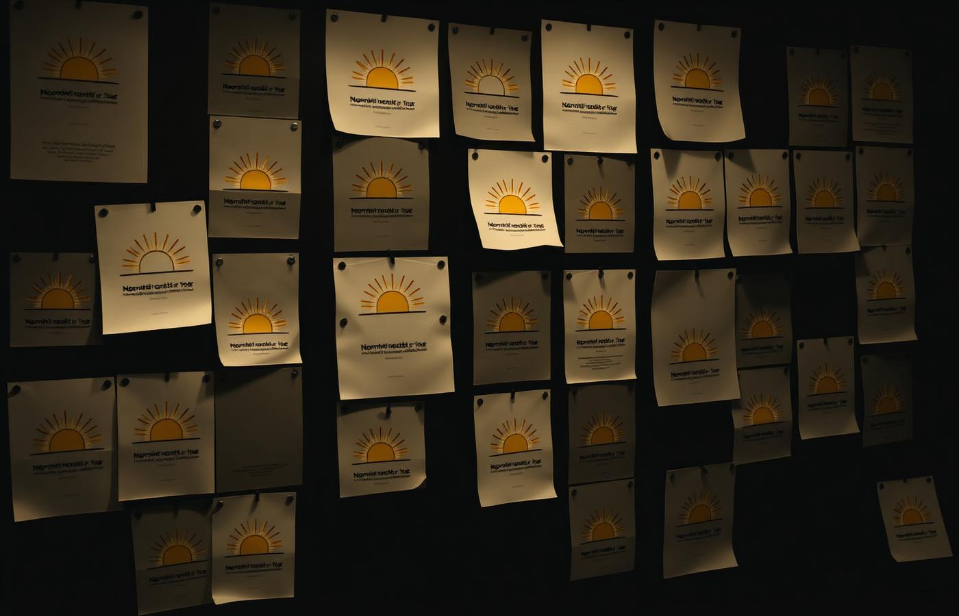
Stage 01 · Identity sketching
From literal sunrise to a geometric ray system
Rounds of hand and vector exploration, printed and pinned so they could be judged at real size. Most were discarded for the same reason: warm, but indistinguishable from a dozen peer charities.
Stage 02 · Information architecture
Nine sections collapsed into two intents
The sitemap was rebuilt around 'I want to help' and 'I need help'. Everything that could not be placed under one of those intents was retired — including pages with internal champions.
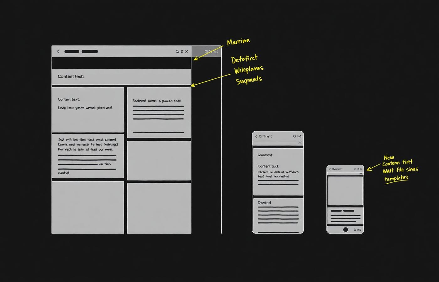
Stage 03 · Content-first wireframes
Real copy before any visual design
Every template was drafted grey, with real sentences in place of placeholder text, so layout decisions had to serve the message. The annotations mark where commitment detail moved above the fold.
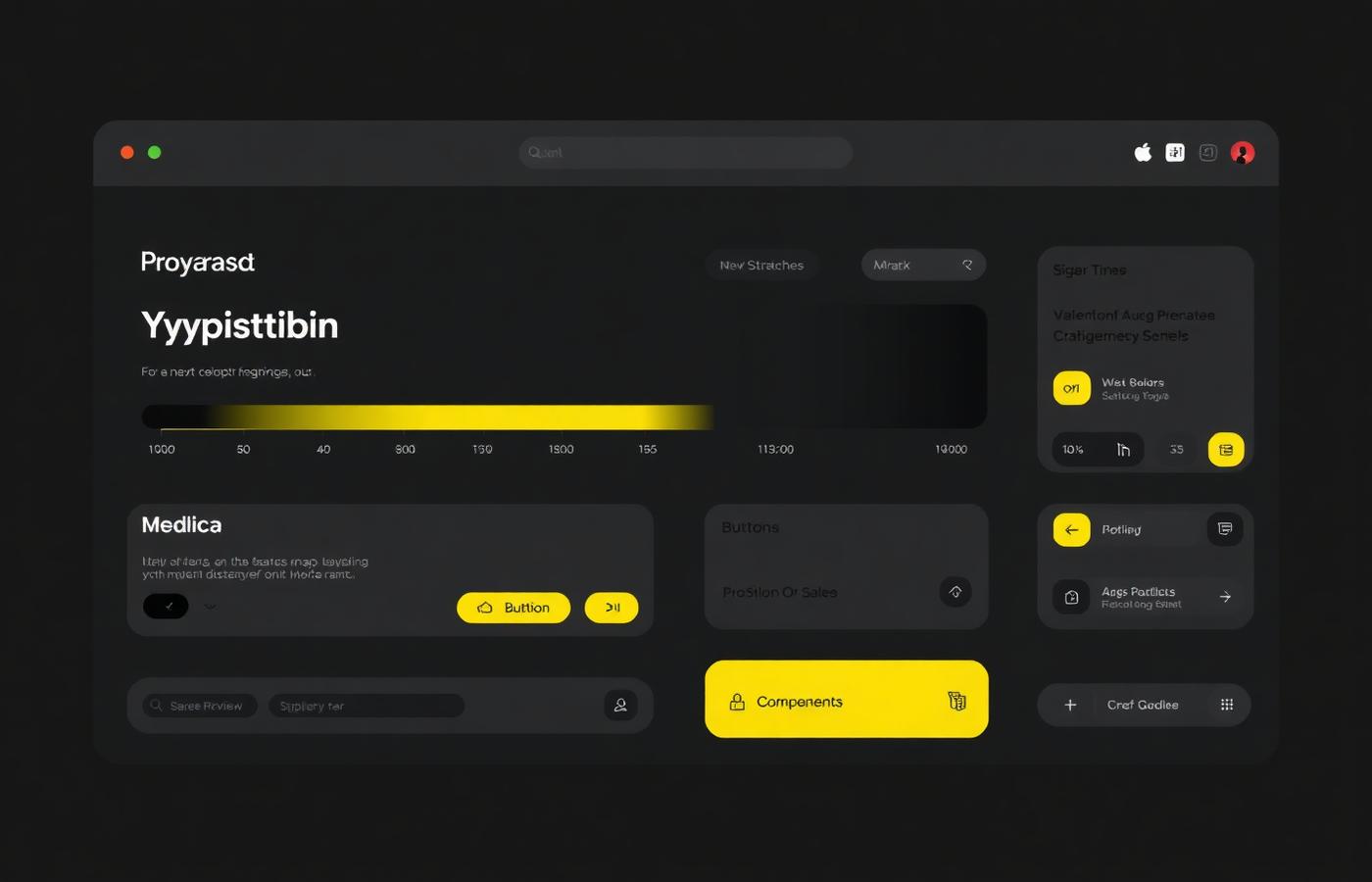
Stage 04 · System and handover
Decisions encoded as tokens and CMS rules
Contrast, focus states and heading rules were fixed at token level and written into CMS field help text, so accessibility and voice survive a volunteer content team rather than depending on one.
07
Challenges I overcame
Twenty-two years of attachment
The board resisted retiring the original logo. I ran a perception exercise showing unbranded peer material to neighbours, which converted the debate from taste into evidence.
No clean analytics baseline
Tracking was misconfigured, so early numbers were unusable. I rebuilt the GA4 event model and held a four-week pre-launch measurement window before touching the design.
Accessibility with a volunteer content team
AA conformance is easy to launch with and easy to lose. I locked contrast at token level and wrote image and heading rules directly into the CMS field help text.
08
Intended impact
The redesign is structured to lift volunteer sign-up by removing the friction that research pointed at: an intent-led architecture, time commitment stated before mission language, and a single unambiguous action on every programme page.
It is also designed for independence. A CMS built around programmes, stories and events, plus an editorial guide, means a two-person communications team can keep recency signals fresh without design support — the condition that makes an organisation read as active.
| Measure | Today | Designed for |
|---|---|---|
| Top-level navigation items | 9 | 4 |
| Clicks from intent to completed sign-up | 7 | 2 |
| Logo variants in circulation | 4 | 1 documented system |
| Programme page opening content | Mission statement | Time commitment |
Gallery
Explore the work
Open the artefacts directly — prototype, live site, documents, video, and before/after comparisons behind Kindred. Each opens in an in-page viewer.